Brand Kit
Official assets and guidelines for using the AstroStake visual identity.
Primary Logo (Horizontal)
Secondary Logo (Vertical)
Logomark & App Icons

App Icon
AstroStake | Brand Kit
Favicon
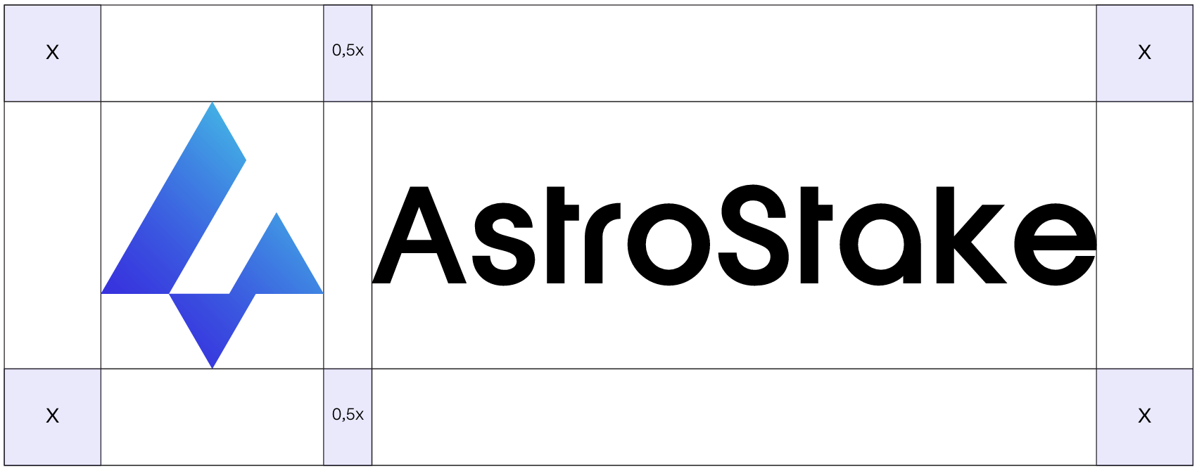
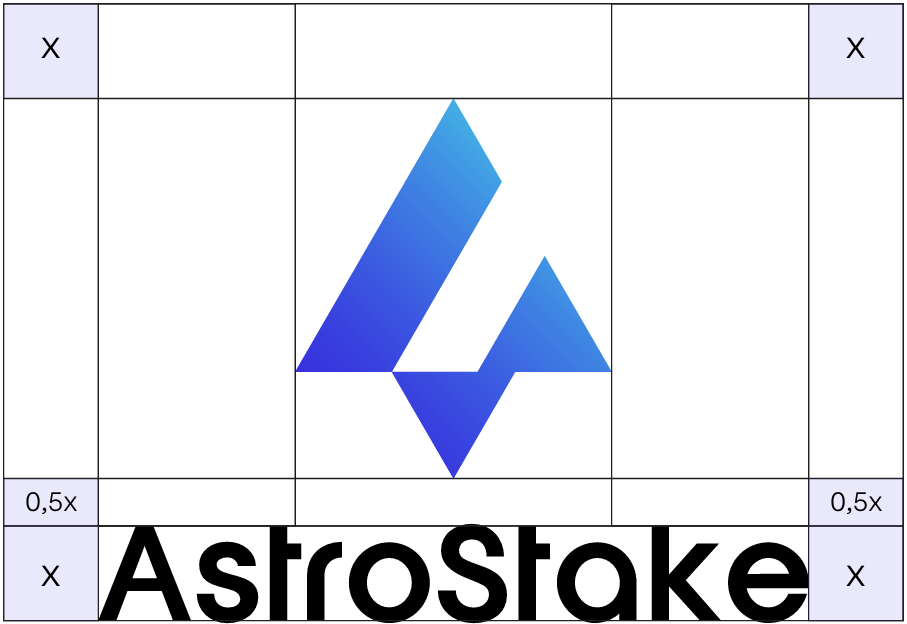
Clear Space
To ensure the logo remains legible, a minimum clear space must be maintained around it. The symbol "x" represents this distance, based on the logo's elements.
Primary Logo (Horizontal)
Secondary Logo (Vertical)
Color Palette
Vivid Blue
Primary brand color.
RGB: 56, 46, 223
CMYK: 75, 79, 0, 13
Sky Cyan
Secondary accent color.
RGB: 70, 194, 231
CMYK: 70, 16, 0, 9
Logo Blue Alt
Alternative blue for gradients.
RGB: 13, 129, 209
Dark Blue
Dark brand color.
RGB: 20, 24, 113
Deep Navy
Deepest navy blue.
RGB: 0, 16, 51
White
Primary background and text.
RGB: 255, 255, 255
CMYK: 0, 0, 0, 0
Primary (UI)
The main color for UI elements.
RGB: 99, 102, 241
Slate (Dark)
Primary background in dark mode.
RGB: 15, 23, 42
Typography
Hanno (Regular)
Hanno (Regular) is used for all brand headings and key text to ensure a unique, modern, and consistent visual style.
View font licenseNomenclature
"Built by Node Runners. For the Networks We Believe In."
Correct: AstroStake
Written as a single word with "A" and "S" capitalized.
Incorrect: Astro Stake, astrostake, Astro-Stake
Avoid spaces, hyphens, or incorrect capitalization.
Do's & Don'ts
Do not change the primary logo colors.
Do not stretch or distort the logo.
Do not blur or add effects to the logo.
Do not rotate the logo.
Do not modify the shape of the logo.
Do not change the position of logo elements.

